
New website causes confusion
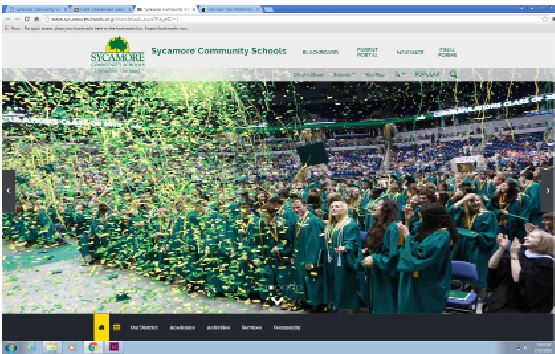
The familiar old design of the SHS district website has been replaced for the first time in years; the new website, however, caused much confusion and controversy amongst students. Pathak said, “I like the new look of the website, since the old design was getting old. It was just really confusing because there are two sign in tabs instead of just one.”
SHS’s district website has remained the same for years. However, last Sat., Jan. 30 for the first time in a while, the website format was altered, causing much confusion.
Sophomore Kaitlyn Jiang said, “All weekend, I was trying to log on to see my grades, but the new website was really confusing and it would not let me log on.”
The majority of the confusion resulted from logging on, as there was a “Sign In” tab and a “Blackboard/Parent Portal” tab.
Jiang said, “I didn’t realize there was a second tab until I used my computer to log on, since the mobile version did not show the ‘Blackboard’ tab.”
Although the “Sign In” tab was highlighted in green, the correct tab for students to sign in was the “Blackboard/Parent Portal” tab.
Sophomore Atit Pathak said, “I like the new look of the website, since the old design was getting old. It was just really confusing because there are two sign in tabs instead of just one.”
Your donation will support the student journalists of Sycamore High School. Your contribution will allow us to purchase equipment and cover our annual website hosting costs.